A New Angle
Another WIP with some new features and a minor update…
 All new angle, the Enterprise as viewed from one of the maintenance bays. “Docking detail” models and lighting, still a WIP.
 Minor Update: Previous scene with a powered down Enterprise. Added detailing to opposite pier wall, and spotlights on Enterprise’s dark underside.
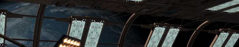
I love close-up and cropped shots that help give a sense of scale to starships. It’s just one of the reasons I love docking scenes in general. So, I decided to add some of those “docking details” (recessed saucer features like airlocks and maintenance access panels) to Dennis Bailey’s Enterprise, like I did to Kevin Riley’s Phobos. I also changed a few textures so the ship could appear in a powered down state. This mostly required removing any luminosity channels from applicable impulse and warp engine surfaces, as well as from the ship’s personal spotlight wells used for the vessel’s self illumination. I did this partly to update the previous Enterprise/lounge shot, but also so I could try a new angle from a more forward viewing perspective. The view port shots from this new angle (at the concourse level) seemed to obscure a few too many desired docking features. Given that, I figured why not make it a broad angle shot as seen from one of the large open doors of the maintenance bay? After all, it is yet another continuous deck that fills the entire pier structure at its level. It allowed me to place the camera a little lower and visualize more of the main gangway, which had been mostly blocked by the saucer just a few decks higher.
I did several takes of the Enterprise with varying degrees of spotlighting and newly modeled “docking details” implemented. Between choosing what to focus spotlights on and where to place details, it can tend to get a little busy, so I was looking for a nice balance. Still, things look exceptionally dark on the underside of the saucer and the ship’s overall (visible) lighting is rather drab from this perspective. This is mainly because, after an eight hour render with the station in place, I chose to remove the station as a time saving maneuver. Rendering the ship alone helped speed things up but lowered the overall reflectivity of other surfaces in the shot, which tends to brighten things up. So I have a bit of tweaking to do if I want to fake that properly.
Here are some of the other versions. The docking details are currently just set in place, and have far more individual detailing to be added.

This one (above) seemed a tad too busy to me, but I really wanted those stand out surface panels to be the focus of the spotlights as they were in some of the drydock shots from Star Trek: The Motion Picture. Only one of these features is detailed at this point. I think my biggest problem here is that so many of the features I spotlighted are already somewhat clumped together. This makes things appear somewhat overworked. Meanwhile, so much of the underside’s remainder is excessively dark. I tried brightening things up by fiddling with the black and white point settings on the original render, but the results were far too grainy. The image is truly just too dark, so another light set up needs to be considered.

Here, I added another recessed area to correspond to one seen in The Motion Picture, but the details within are primitive and the busy factor only increases. If I could brighten up the underside of the hull a tad (especially on the starboard side), I might be able to eliminate that larger spotlight aimed at the NCC lettering (only there because the lettering would be virtually invisible without the spotlight). This would not only improve the visualization of the hull itself, but could reduce the blight of busy considerably.

Good update Basill.
Thanks. I’ll have a little something more this morning. Only minor though.