2D Graphics
Thought I would compile a few movie era 2D graphics that I’ve worked on and posted over the years. My 3D models require I create some 2D graphics to help in the surface texture department, and this is my contribution. I’ve tried my best to duplicate the on screen appearance of many graphics I’ve appreciated from the Star Trek franchise over the years, but despite the huge quantity of reference materials available to just about anyone, I find even that remarkably lacking in relation to the sheer level of detail that many of them actually depict.
First up…
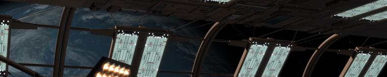
Some bridge and other starship graphics inspired by Star Trek: The Motion Picture and its more immediate sequels.
 Important helm and navigation station elements.
 The main astrogator wheel display within the central base of the conn station.
 A small panel at the base of the astrogator just to the left of the navigator’s station.
 Another small astrogator panel just to the right of the helm station.
 Main technical specs for the ship’s gravity generator at the artificial gravity station. The station most likely offered fine tuning of the tractor beam control functions as well. With the limited references available, most of these text labels rely on some artistic license.
 A panel incorrectly labeled for a never realized “internal transporter station,” designed for the bridge, based on original reference drawings from the abandoned series Star Trek: Phase II. This panel would nevertheless be implemented for the movie sets, its labels eventually refashioned as part of the artificial gravity station. I plan on tweaking the graphic’s text to reflect its final implied functions.
 Though also designed for the Phase II “Enterprise” bridge and labeled specifically for tractor beam function, this graphic was only visible during TMP from inside the control center of the Epsilon IX communications station. It eventually made its way to the Enterprise‘s main engineering section for Star Trek II: The Wrath of Khan, within the transparent barrier compartment where Spock would sacrifice his life for crew.
 My attempt to mimic some back lit effects on some diagnostic monitors located at the environmental control station.
 A far less glamorous, though still unquestionably vital element of environmental control. At least on of these is also seen at a console in engineering.
 A blend of station elements from environmental control to damage and repair. This is my latest attempt and is still being tweaked with new elements added.
 Communications console elements.
 Communications main overhead display.
 Internal security control monitors. There are four such monitors at this particular station, two pair flanking either side of the station’s main console. These two separate displays can be duplicated however, to match the four monitors.
 Here are several elements from consoles dedicated to primary engineering access and control. There are two of these major consoles that, though not identical, have remarkably similar features. One is on the bridge and provides major remote access to main engineering command. The other is, of course, located in main engineering itself. This particular graphic is based mainly on the engineering location.
 Engineering station monitors located on the main bridge.
 Upgraded version of the radiation emission indicators (far right) in the console’s impulse control section. The blue graphs to the left were always seen on the bridge.
 The red graphs were seen in engineering in TMP but, like many color alterations between productions, were changed to green for TWOK.
 Some elements seen on panels surrounding the primary intermix core in main engineering.
 Control panel for the airlock/elevator room seen in TMP and later used near the torpedo room airlock in TWOK.
 Seen aboard the Reliant in TWOK, I’ve attempted to recreate this telemetry array monitor, although my current references make it very difficult to make out some of the smaller text labeling.
 A standard sickbay biobed monitor.
When Michael Okuda’s “Okudagram” exploded onto the scene in Star Trek IV: The Voyage Home, Trek-tech ran with it and rarely looked back. It practically redefined the way Trek production design would be seen for years to come. Star Trek: The Next Generation made it The standard, but the Kirk era movies to follow were still fictionally set many decades prior to Picard’s TNG times. Thus, distinct styles were developed to help distinguish the two periods more effectively.
Here I’ve attempted to replicate or mimic some graphics used in the later Kirk era films.
 A communications station display of a subspace communications network. It was meant to mimic the style of Okuda’s first efforts for Star Trek IV: The Voyage Home, and Star Trek V: The Final Frontier.
 A updated version meant to mimic the more varied color ranges visible in Star Trek VI: The Undiscovered Country.
 This display is some type of wide angle map or far reaching sensor scan seen in ST VI: TUC, and several of the spin off series when they featured flash-back scenes to Kirk era times or featured Starfleet vessels considered antiquity by TNG’s period setting.
 A wonderful list featured in ST VI: TUC, indicating the current missions of several Starfleet vessels during the film’s key events. TNG also has several such fascinating trivials, though I rarely delve into that era for inspiration these days.
After incorporating many of my 3D mesh interiors into my previously built 3D construct of the Akyazi Class- Perimeter Action Ship, USS McCook, it required I have some nice backup graphic textures, featuring technical and orthographic views of the vessel, on hand.
 Orthographic top.
 Port.
Port.
 Fore.
Fore.
 Technical system’s overview.
 Warp engine technical specifics.
 A collection of cargo labels, initiated for use in several of my interior cargo bay models. Some are attempts to replicate the genuine versions originally designed by Lee Cole for use in The Motion Picture, but I only ever saw a limited assortment of symbols. I wanted to increase the semiotic lexicon of cargo labels meant to represent the enormous variety of materials that would be necessary for a ship to stockpile before journeying across the stars. So, while keeping with the standardized form, I threw in a few new icons and colors to help expand the options.
 Some have little in-jokes or homages (like this one). While perusing the internet for grain symbols (mostly in an attempt to create a label meant to represent “quadrotriticale” from TOS’s “The Trouble with Tribbles”), I stumbled across this deliciously simplistic symbol for the now defunct Canadian Wheat Board. While intended as a mildly abstract though recognizable symbol for an ear of wheat, its use of a mere four grain florets made it perfect for my needs, so I incorporated it into my label. I gave it the code QT4 (directly below the symbol), to help represent the name and nature of the product, while I also aimed for a more “harvest” oriented color palette.
More later…

Wow!! Ive been looking at all your art and you are brilliant!!! I wish to know how to do this and what program you are using to generate the mesh
Well, thanks! I’m not sure how brilliant I am, but I sure try to be a little shiny every now and then. 😉
Everything on this page is simply a collection 2D graphics done with either Photoshop (on my older, currently defunct PC) or Pixelmator (on my much newer Mac). They tend to be relatively basic shapes, lines, and texts combined with other multiple layers, each tooled in their own way and set to varying opacities. The eventual overall combination helps to better define shapes and/or enhance overall textures. It can be a lot of copying and pasting, and a whole host of clever tools. Colors can be tricky, but luckily they can be flexible. Images and screen caps often serve as templates in the background layers initially, but the final product is always a new renderering. The template subjects are typically highly enlarged and thus rarely crisp, much less “perfect.” Screen cap references nearly always need to be corrected for any perspective distortions.
This is essentially the process. 😀
This is really nice work
Many thanks! 🙂
Do you have Enterprise deck plans you work from, or are they the very old ones from Strategic Design? The plans I have seen there have a very bad use of deck space with needless turbolift corridors looping round the saucer taking up far too much space. Would be great to see your plans if you have reworked this at all?
Well, I’ve yet to create viable deck plans of my own for any particular ship, but I have used schematics from a variety of sources to help plan out many of my 3D model interiors (any ship). Then again, sometimes I just have to improvise. When there are no such plans available (or I simply don’t like anything provided), I actually enjoy working backwards a little, building interior structures by gauging the overall shape of an exterior hull and the detail elements that line it.
I don’t think I have any one set of plans that I’m entirely devoted to, since someone always manages to come along and make improvements to a design, even if the most minute. Sometimes it’s just certain specific details I’ll embrace, and at other times it’s more of an overall but slightly incomplete acceptance.
Please contact me via my e-mail. I would like to discuss the use of your graphics with a project of mine.
Contacted your e-mail. Did you get it?
Good God…I just had a massive nerdgasm. This is FANTASTIC work. What a great job you’ve done. The TOS movie era production design and consoles have always been my favorite. This is really fun stuff to loom at. I wish I had talents lime this. Great work. I’d love to see more!
Well, I suppose nergasm is the ultimate goal aimed for (or at least one of several high priority targets 😉 ). Glad you liked it! Hopefully, I’ll have more additions in the future. 🙂
Amazing work. Well done!
Thanks! 🙂
These are awesome – we’re looking to build a stage set for my kid’s school play – and these would be perfect additions to the displays in the bridge. Would you be interested in selling a one-time use for higher res art??
Thanks. Been on vacation. You are free to use anything you find posted here at your discretion, but I’m afraid I don’t currently have the free time to devote to higher resolution imagery, nor would I feel comfortable profiting from any of this subject matter at this time.
I’m very impressed by your work. Love the symbols and colors. One question though: what font do you use one the labels?
Which font exactly are you referring to? Honestly, it’s been so long and there are so many that, other than the standouts like Microgramma & Eurostile, I don’t recall most. I had to pay for the genuine Microgramma versions, and they were the most accurate for that unmistakable Movie-style font. However, there were a few other freebie downloads years back like, “Starfleet Bold”, Starfleet Bold Extended”, and several versions of “Federation” which I also used amply.
As for the less remarkable types frequently used on the older style consoles and labels, I was usually just eying things to make sure they would pass muster. Mine were either typical universal fonts or Macintosh specific. They couldn’t be too wide, too narrow or too pixelated or “choppy”. And most importantly, they were all sans serif. Still, all were either just a mix of various unremarkable fonts available to me at the time via my Apple software, or they were those specific standouts which I always felt had a lasting impact on the Movie Era production design.
Using Google, I’m viewing one online right now that sounds as boring as any I ever used for the more simple labeling; Known as “Context Ultra Condensed Bold”, it looks pretty similar to what I employed, but I can’t be certain.